
I love creating realism colored pencil art, it’s a time I get to escape the hectic world for a few hours, and just focus on something beautiful like this cardinal.
At first glance someone may say the cardinal is just red and black, but when you take time to study it, you can see so much more colors. The red in the cardinal transition from yellow-orange, to varying degrees of red, violet, and deep blue in the shadows.
Before starting I take the time to study the reference image to find the lights and shadows and the transition of colors. I study the feather texture, the length, and directions, and the shapes formed. I would zoom in and out of the reference photo, squint my eyes, and even take a few steps back to see the contrast better.
This step is probably one of the largest contribution to my growth as an artist. As a beginner I was so eager I would rush into things, excited to use my new materials, and excited to produce something spectacular. But somehow I ended up with something missing depth or realism. What I was missing was that initial reference study time.


The colored pencils used are Prismacolor Premier softcore colored pencils.
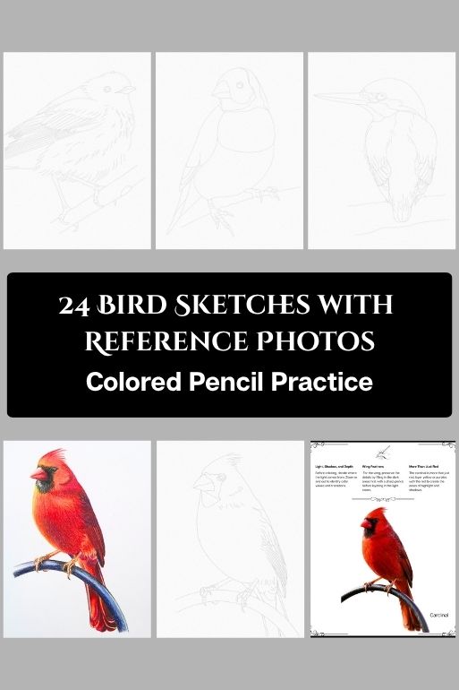
The Cardinal sketch is from my colored pencil practice coloring book, Bird Sketches. Which includes 24 hand drawn sketches and reference photos. It also includes a swatch and blending charts, and tips to get you started.
Available from my Etsy shop:




You must be logged in to post a comment.