
When I started coloring this Lily Flower I thought I messed up, the pink I chose for the base color was darker than the shade in the picture, but I went ahead and built up my layers anyway, the final results is bolder than the original image but I actually love the depth and contrast.
I sometimes have very brief moments of self doubt starting new projects. I guess it feels like what others would call imposter syndrome, but for me it appears like a blip, sometimes I’m just like, “Oh no, I think I’m in over my head, this may be beyond my capabilities”. But then there’s a louder part of me that’s like, “Let’s roll with this and see where it leads, worse case I learn some valuable lessons.”
So with my optimism and open mind I charged ahead to finish coloring the Lily flower.
The first thing I do with every sketch is take time to study the reference photo carefully. I will zoom in and zoom out, squint my eyes and identify the areas of high and low lights. This flower is a very light shade of pink with soft ridges along the edges of the petals. The petals in the back are also slightly darker.
I worked on one petal at a time, giving attention to the soft details.
I start by lightly applying the base color making sure to preserve the white areas, then add a light layer of the shadow colors.
Regarding Shadows, never use black or grey. To preserve the vibrancy of your drawing use a complementary color or analogous colors. For the pink of this Lily flower, the complementary color for pink is a bluish green, and the analogous color would be purple. The complementary color would give you a deeper shadow, while the analogous color would give you a softer shadow.
I used purple for the shadow in this drawing. Layering very softly and in a gradient pattern, gradually lightening as I worked toward the light areas. My strokes also followed the contours of each petal.
I used a blending stub to soften the edge where the shadow ends. I also used a white pencil to blend the highlights and the light pink and light yellow areas.
I always focus on a small section at a time so I don’t miss details, and build the color a light layer at a time. Use a gradient technique for going from dark to light, and blend well the edges where the shadow ends.


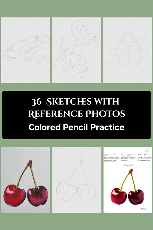
This Lily Flower is colored with Prismacolor Soft Core Colored Pencils and a hand-drawn sketch from my coloring book for color pencil practice available on Etsy:


You must be logged in to post a comment.